Creating a Responsive Navbar with JavaScript
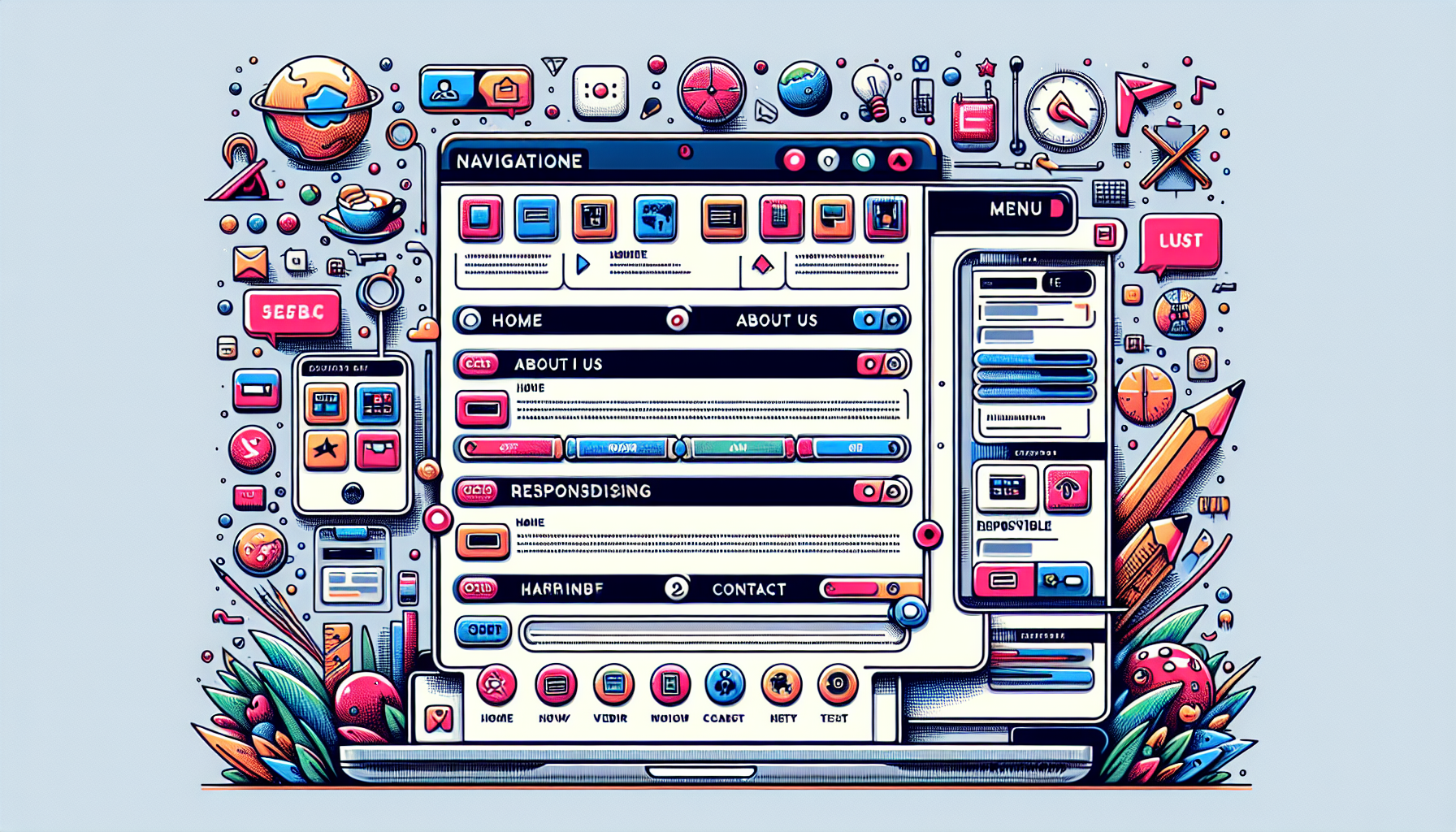
Creating a Responsive Navbar with JavaScript
Building a responsive navbar using JavaScript is a common task for web developers.
A responsive navbar adapts to different screen sizes, providing a user-friendly experience.
JavaScript is a powerful tool to create dynamic and interactive elements in a navbar.
Here is a step-by-step guide to creating a responsive navbar using JavaScript, along with examples.
**To create a responsive navbar, use the HTML structure, the CSS for styling, and JavaScript for functionality.**
TLDR: How to Create a Responsive Navbar with JavaScript
Create a navbar using a combination of HTML, CSS, and JavaScript.
Use Flexbox or CSS Grid to control the layout and JavaScript to handle menu toggle on smaller screens.
Below is an example of a responsive navbar!
// HTML Structure
// CSS Styling
// JavaScript Functionality
Understanding the HTML Structure
The HTML structure of the responsive navbar is simple.
It consists of a nav element containing the brand name, a toggle button, and a list of menu items.
The toggle button is hidden by default.
The menu items are displayed as a flex container.
Exploring CSS Styling
CSS is used to style the navbar and its components.
Flexbox is utilized to lay out the navbar brand and toggle button.
Media queries are employed to handle different screen sizes.
A closer look at the CSS:
- The navbar uses flexbox for layout.
- The toggle button is hidden on larger screens with
display: none;. - The menu items are displayed as a flexbox container.
- On smaller screens, the toggle button becomes visible, and the menu items are initially hidden.
- The
.activeclass is added to the menu to display it when the toggle button is clicked.
Implementing JavaScript Functionality
JavaScript is used to toggle the visibility of the navbar menu on smaller screens.
The event listener is added to the toggle button, which toggles the .active class on the menu.
This ensures that clicking the toggle button will show or hide the menu.
Common Issues and How to Fix Them
Issue: Navbar not toggling
This usually happens if the JavaScript is not linked correctly or the IDs do not match.
Check your JavaScript console for errors and ensure the IDs in the script match the HTML.
Issue: Menu items not aligning properly
This issue can be due to incorrect CSS Flexbox properties.
Make sure you have used justify-content and align-items properties for proper alignment.
Issue: Misaligned toggle button
Ensure that the CSS for the toggle button has proper margins and padding.
This ensures the button is centered and aligned properly.
Enhancing the Navbar with Additional Features
You might want to add more features to your responsive navbar.
For example, you could add dropdown menus, animations, or a search bar.
Animations can be achieved using CSS transitions.
Dropdown menus can be handled with additional JavaScript.
FAQs
How do I make the navbar collapse on small screens?
Use CSS media queries to hide the menu and display the toggle button.
How can I add a toggle transition effect?
Add CSS transitions to the .navbar-menu class.
What if the navbar items overflow on large screens?
Use CSS properties like flex-wrap to handle overflow.
You can also use responsive font sizes.
Can I customize the toggle button?
Absolutely.
You can style the toggle button using CSS to match your design.
How do I handle the navbar in a single-page application?
Use JavaScript to handle smooth scrolling and section highlighting.
Adding Dropdown Menus to Your Navbar
Dropdown menus provide a way to group related links under a single menu item.
To add a dropdown menu to your responsive navbar, you need a mix of HTML, CSS, and JavaScript.
Here is an example of how to implement it.
// HTML Structure with Dropdown
// CSS Styling for Dropdown
// JavaScript for Dropdown
Understanding and Enhancing Dropdown Menus
The dropdown menu in the example above is activated on hover for desktop views.
For mobile views, JavaScript is used to toggle the visibility of the dropdown menu.
The class .active is dynamically added or removed using JavaScript based on user interaction.
CSS styling for the dropdown menu:
- When hovered over, the dropdown menu appears.
- On smaller screens, the dropdown menu is toggled using JavaScript to handle touch interactions.
Adding Animation to the Navbar
Adding animations can enhance the user experience.
Animating the toggle and dropdown menu can be achieved using CSS transitions.
Below is an example of how you can add smooth animations.
// CSS Animation
Increasing Accessibility
Accessibility is crucial for a wide-reaching audience.
Ensure your navbar is accessible by adding ARIA attributes.
These attributes help screen readers and assistive technology understand the webpage structure.
Below is an enhanced HTML structure with ARIA attributes.
// HTML with ARIA Attributes
// JavaScript Enhanced for ARIA
Improving Performance with Debouncing
Debouncing helps to improve performance by limiting how often a function is run.
This can be particularly useful for handling resize events.
Below is an example of implementing debouncing.
// Debouncing Function
Optimizing for Performance
Performance is key for a smooth user experience.
Minify your CSS and JavaScript files to reduce load times.
Additionally, use lazy loading for images and other resources.
FAQs
How do I make the navbar collapse on small screens?
Use CSS media queries to hide the menu and display the toggle button.
How can I add a toggle transition effect?
Add CSS transitions to the .navbar-menu class.
What if the navbar items overflow on large screens?
Use CSS properties like flex-wrap to handle overflow.
You can also use responsive font sizes.
Can I customize the toggle button?
Absolutely.
You can style the toggle button using CSS to match your design.
How do I handle the navbar in a single-page application?
Use JavaScript to handle smooth scrolling and section highlighting.
Shop more on Amazon